Dizzybomb
Dizzybomb识动,2020年创立于上海,专注于为现代女士和男士提供独特的穿着体验。当下,人们对于服装的需求已不再局限于“实用性和实穿性”,“悦己”的需求正被越来越多的消费者提及。作为服饰领域中的一个“小”部分,袜子正逐渐成为现代时尚穿搭中吸睛的重要配角,越来越多的人将袜子视为整体造型的点睛之笔。
作为一家以袜子为核心产品的年轻服饰品牌,Dizzybomb鼓励现代人认识自己、欣赏自己、取悦自己。在Dizzybomb的理念中,袜子不只是可有可无的配饰,更是连接趣味生活与审美品味的织带。
作为一家以袜子为核心产品的年轻服饰品牌,Dizzybomb鼓励现代人认识自己、欣赏自己、取悦自己。在Dizzybomb的理念中,袜子不只是可有可无的配饰,更是连接趣味生活与审美品味的织带。
Dizzybomb, founded in Shanghai in 2020, focuses on providing unique wearing experiences for modern women and men.Nowadays, people's demand for clothing is no longer limited to "practicability and wearability", and the need to "please oneself" is being mentioned by more and more consumers. As a "small" part of the clothing field, socks are gradually becoming an eye-catching and important supporting role in modern fashion wear. More and more people regard socks as the finishing touch of the overall look.
As a young clothing brand with socks as its core product, Dizzybomb encourages modern people to know themselves, appreciate themselves and please themselves. In Dizzybomb's philosophy, socks are not just a dispensable accessory, but also a webbing that connects interesting life and aesthetic taste.
As a young clothing brand with socks as its core product, Dizzybomb encourages modern people to know themselves, appreciate themselves and please themselves. In Dizzybomb's philosophy, socks are not just a dispensable accessory, but also a webbing that connects interesting life and aesthetic taste.

Logotype
“认识赏识,心动悦动”是Dizzybomb品牌的核心理念。我们将“识别”作为中心概念,提炼出“眼睛”作为视觉元素,将其设计重组最终得到了一个具有高识别度的品牌符号。左右灵动的眼睛象征着持续探索全新自我的态度,同时也表达了时刻欣赏和取悦自己的品牌理念。
"Knowing and appreciating, moving with joy" is the core concept of the Dizzybomb brand. We took "identification" as the central concept, extracted "eyes" as the visual element, and reorganized its design to finally obtain a highly recognizable brand symbol. The moving eyes on the left and right symbolize the attitude of continuing to explore the new self, and also express the brand concept of always appreciating and pleasing oneself.


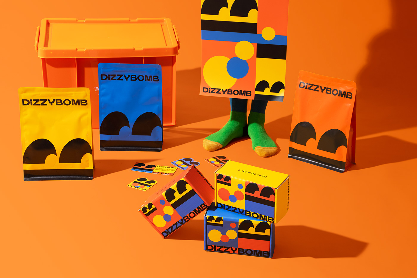
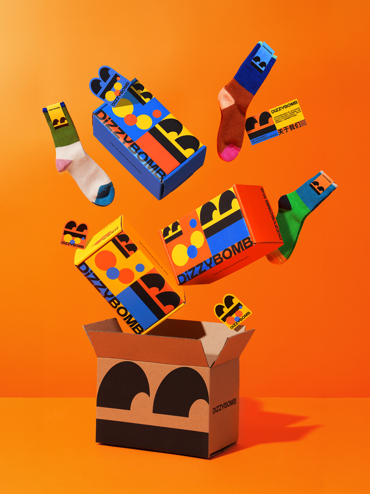
Vision Series
我们以基础通勤、玩转设计、活力功能三大产品系列为基础逻辑展开设计。根据每个系列对应的不同特点分别提取了黄、橙、蓝三种色彩,并提炼了“烟雾”、“爆炸”、“螺旋”三个视觉元素与颜色搭配,构成了同一风格下三种不同的视觉呈现,延伸到品牌的不同板块中形成系统。
We develop the design based on the three major product series of Essential, Fun, and Active. According to the different characteristics of each series, three colors of yellow, orange and blue were extracted, and the three visual elements and color combinations of "smoke", "explosion" and "spiral" were refined to form three different colors under the same style. The visual presentation extends to different sections of the brand to form a system.


Online Shop
Dizzybomb的产品线丰富且多样,在线上端的视觉呈现需要兼顾品牌整体的统一性。我们将品牌线上网店进行了模块化拆解,将品牌色、品牌符号与各内容板块进行结合,突出产品的同时进一步体现Dizzybomb的品牌视觉特征。
Dizzybomb’s product line is rich and diverse, and its online visual presentation needs to take into account the overall unity of the brand. We dismantled the brand's online store into modules and combined the brand colors, brand symbols and various content sections to highlight the products and further reflect the Dizzybomb brand visual characteristics.


Creative Director:Meng Jiayang
Design Director:Meng Jiayang
Designer:Wang Zhiheng, Chen Wei,Wang Zhihong,Xu Wenyang
Photographer:RedPeach
Design Director:Meng Jiayang
Designer:Wang Zhiheng, Chen Wei,Wang Zhihong,Xu Wenyang
Photographer:RedPeach
Check out more of our work on


